You could have all the data in the world, but it’s useless if you can’t interpret it. The true test of a visual analytics tool is whether it can display information in a way that best helps you understand the situation you are analyzing.
Here at Agital, we’ve tested many marketing analytics tools over the years, but we couldn’t find the right one to fit our needs. We needed a solution that could pull in the information we needed and display it through easy-to-read reporting visuals that we could easily customize.
So, we took matters into our own hands and built our own proprietary system. Meet Agital Impact.
If you’ve been an Agital client over the last year, you’ve seen Agital Impact reports and experienced firsthand how it can create simple, easy-to-follow visualizations of data and key performance indicators that provide insights into business and marketing efforts. Collaboration between our teams and our clients is made easier, allowing us to work with our clients to make confident marketing decisions.
For those who have not worked with us (and you should because our clients tell us we’re pretty great), we’re happy to give you an inside look at what Agital Impact is and what makes it stand out in the world of visual analytics tools.
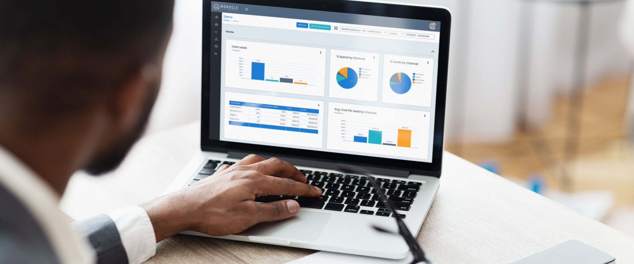
Agital Impact is an analytics data visualization tool that pulls up-to-date online data. When working offline or lacking an API, you can still access data through Agital Impact by importing custom CSVs.
Agital Impact’s data analysis and visualization functionality allows you to set up multiple sources side-by-side in graphs, charts, or tables. You can also use specialized tools, such as calculated data sets, to combine data from multiple sources into one total when needed.
Once you gather the data you need, you can view that data in two very different ways with Reports and Dashboards.
With Agital Impact Reports, you can perform visual data analysis through graphs, tables or text boxes and move them around a canvas-style template with ease. Create unique reports you can lay out specifically to best suit your (or your client’s) needs.
Users can eliminate additional work by duplicating visualization elements and updating the date range of a report. Data is updated across the entire report making month-to-month reporting quick and easy.
In Agital Impact’s Dashboards, you can create a grid layout to allow for quick buildouts, providing a great way to save time and resources. The viewing experience is interactive and in near real-time. Pull information as quickly as your APIs can update, so you can view the state of your business and marketing efforts when you want to see them, on your time versus waiting for a monthly report to be created.
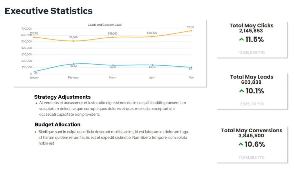
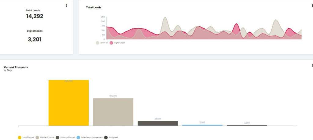
Insights are simple to read with helpful options to display highly granular views that detail the information you need most. When tracking a specific metric, like leads, for example, Agital Impact helps you identify your lead-generating performance and pinpoints exactly where your audience falls within the marketing funnel.
With Agital Impact, you can configure an executive dashboard for more overarching needs. Simply connect your data sources and set up the visualizations to produce an alternate view of your data. Leadership can then receive up-to-date information at the cadence of your choosing.
When working with our clients, it’s essential we provide actionable data and visualizations that they can use to improve their marketing efforts. With Agital Impact Dashboards, you can set up access for clients looking to be more involved in those efforts or simply to view the most up-to-date information, allowing them to view what matters most to them at any given point.
Reports can be tailored to present a visual data analysis that best supports a client’s needs and in a way that makes the most sense to a specific audience (ex: corporate vs. division or executive-level specific reports).
Agital Impact has been so successful in providing our clients with data, we also use it within our operations to best support our clients’ needs.
With Agital Impact Dashboards, we can give team members access to more in-depth reporting than our client-facing reports. This allows for a better understanding of our clients’ data and helps validate that data, ensuring our reports line up with what our clients are also seeing.
Since we started using Agital Impact for our clients, it’s been met with overwhelmingly positive results. Agital Impact’s data analysis and visualization help us paint an accurate portrait of what’s really happening in the digital world and presents it in an effective way for any audience.
If you have questions about Agital Impact’s features, or are interested in working with Agital to set up and provide visualizations and insights into your data, please contact our team, and we’ll be happy to walk you through the process.
Steven is the Agital Impact onboarding specialist here at Agital and is our go-to for getting our clients set up for success on this new and innovative platform. Contact Steven and the Agital Impact team today if you have questions regarding what Agital Impact can do for your reporting and analytics strategy.